
More Than A Colour: The Shades Behind Luxury’s 7 Iconic Brands


“You think this has nothing to do with you,” Miranda Priestly famously tells Andy Sachs in The Devil Wears Prada, before turning her seemingly ordinary blue sweater into a masterclass in fashion. Her point? That sweater didn’t simply happen to be blue; it was a particular shade of blue — cerulean — a colour that had appeared in countless designer collections, including Oscar de la Renta’s 2002 collection of cerulean gowns, Yves Saint Laurent’s cerulean military jackets and the work of eight other designers. Somewhere along the way, influential names in the world of fashion and design had decided that this particular shade of blue — actually, “cerulean” — mattered.
Luxury fashion has been taking note of the power of colour for decades. Some houses have taken a single shade and made it so unmistakably their own that it can speak before a logo ever gets the chance. Think Hermès’ highly saturated, warm-toned orange, the iconic Tiffany & Co. blue and Bottega Veneta’s green, popularised by designer Daniel Lee in 2021. The result is branding reduced to a visual shorthand: you see the colour, and your brain fills in the name. Repeated across packaging, campaigns, stores and products, these signature shades become part of a house’s visual language, carrying years of history and recognition.
Here are a few colours that have become instantly synonymous with the brands they represent.
Hermès | Orange
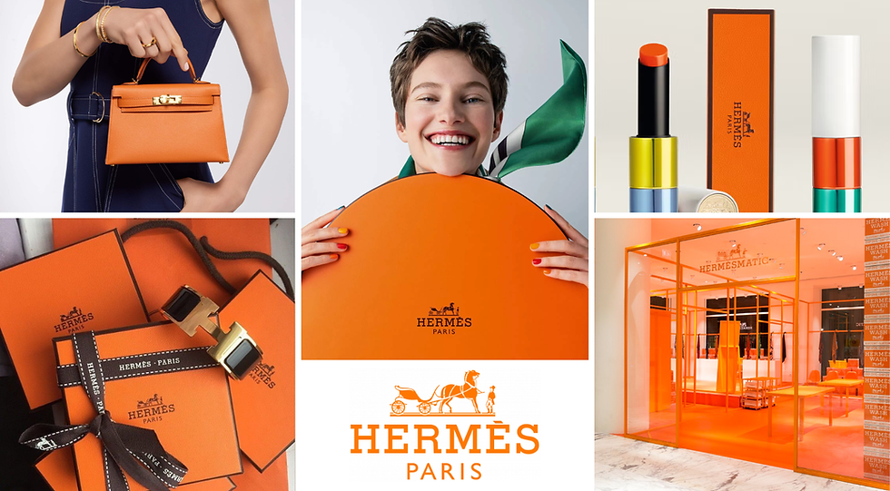
It’s hard to imagine Hermès without its iconic orange boxes, but the colour was never part of the plan. In 1942, during the Second World War, a shortage of cream-coloured cardboard meant the French fashion house had to use whatever its supplier could provide. The only option available was a batch of orange boxes. What began as a practical alternative soon became one of fashion’s most recognisable colours — Orange, Orange H or Classic Orange within the brand, with the colour code 93. Today, that unmistakable shade is enough to signal Hermès before the ribbon is even untied.
Tiffany & Co. | Robin's Egg Blue

No single colour in fashion carries quite as much romantic magic as Tiffany Blue. Before the lid even lifts, the blue box has already made its statement. Years before the Pantone Color Institute existed, founder Charles Lewis Tiffany chose a delicate robin’s-egg blue for the cover of the house’s 1845 Blue Book. The shade was inspired by the popularity of turquoise jewellery during the 19th century. What began as a catalogue cover quickly evolved into an empire-defining signature and eventually became so synonymous with the house that Tiffany & Co. trademarked it as a colour.
Tiffany & Co. registered Tiffany Blue as a colour trademark in 1998, and in 2001, the shade was standardised by Pantone as a custom colour named “1837 Blue”, in honour of the year Tiffany & Co. was founded. The signature blue is almost as recognisable as the jewellery itself, turning a single shade into a defining symbol of the house.
Christian Louboutin | Red

A sexy stiletto with a bright red sole is impossible to mistake for anything other than Christian Louboutin. In 1992, at the designer’s Parisian atelier, Christian Louboutin was developing and finalising the prototype for the Pensée model when he felt the black sole was too dull and disrupted the design. His eyes fell on his assistant, who was applying vibrant red nail polish. In a spontaneous gesture, he grabbed the bottle and painted the sole from toe to heel. The transformation was immediate — the shoe came to life.
What began as a spontaneous pop of colour soon became the defining signature of the house. More than three decades later, the semelle rouge remains one of fashion’s most recognisable visual codes.
Valentino | Pink PP

In 2022, Valentino’s then-creative director Pierpaolo Piccioli sent 48 head-to-toe looks in vivid pink down the runway for the Fall/Winter 2022–23 collection. He didn’t just present a collection; he sparked a visual phenomenon. Developed in collaboration with the Pantone Color Institute and named after Piccioli’s initials, Pink PP, a saturated magenta hue, quickly became a defining colour for the house, appearing across everything from clothing and accessories to footwear.
The collection’s striking monochromatic styling also helped propel the Barbiecore aesthetic into the mainstream, with celebrities including Zendaya and Florence Pugh embracing Valentino’s vivid pink. Bold, saturated and impossible to miss, Pink PP gave Valentino a fresh visual identity and established the shade as one of fashion’s most recognisable colours of the decade.
Bottega Veneta | Green

Bottega Veneta’s signature green is a relatively recent addition to the house’s design language. Introduced under former creative director Daniel Lee, the vivid green shade became a defining feature of his debut Spring/Summer 2021 collection and quickly became impossible to miss. From padded Cassette bags to shoes, clothing and even show spaces, the electric green appeared across the house with a confidence that made it stand out. Widely referred to as “Bottega Green”, the shade became synonymous with Lee’s era at the Italian house, giving Bottega Veneta a bold new visual identity beyond its iconic intrecciato weave.
Fendi | Yellow

Fendi’s signature yellow has roots that go back to the 1930s. Inspired by pergamena, the Italian word for parchment, the warm, parchment-like yellow hue was originally used to line the Roman fashion house’s fur trunks. What began as an understated detail gradually became part of Fendi’s visual identity, appearing across its bags, packaging, and ultimately the runway.
By Fall/Winter 2012, Karl Lagerfeld and Silvia Venturini Fendi gave the shade a bolder expression with a scintillating yellow fur coat. Years later, for the Men’s Fall/Winter 2020-21 collection, the house transformed its signature paper shopping bags and cardboard boxes into leather accessories, all rendered in the now-iconic Fendi Yellow. Today, the shade is as recognisable as the house’s iconic double-F logo.
Chanel | Black

There are only a few moments in fashion that have changed the way we see an entire colour. One such moment came in 1926, when Chanel introduced the little black dress, with a simple crepe de chine design featured in Vogue. It moved away from corsets, excess fabric, and rigid silhouettes. So accessible and modern was the design that editors dubbed it “Chanel’s Ford,” comparing it to the Model T automobile.
At the time, black was largely associated with mourning and service uniforms. Chanel transformed its meaning, presenting it as refined, versatile and distinctly modern. The uncomplicated silhouette allowed women to move freely and dress for changing routines, reflecting the social shifts taking place after the First World War.
A century on, the little black dress remains one of Chanel’s most defining signatures and a timeless staple of everyday fashion. Reinterpreted through changing silhouettes, fabrics and creative directors, its central idea has stayed remarkably intact: that elegance does not need excess. What debuted as a radical approach to everyday dressing became the ultimate foundation of modern fashion, proving that the most powerful signatures are often the simplest.


Comments